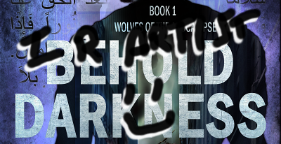
Thou Shalt Not
Don’t do your own cover art, the omniscient They say. Well, I thought I new what those inhabitants of the Q Continuum meant: let the artistic pros do their work to design and produce your cover. Easy! Just give them some details about your book, maybe even a chapter, then sit back and wait for their visual arts and Photoshop skills to do the rest. They went to school for this, they do this as their J-O-B, and people P-A-Y them to do this.
One Does Not Simply FIND a Cover Artist
Armed with this idea, I headed out on my quest to find a cover artist, with all the gusto of Frodo leaving the Shire to drop the One Ring in Mt Doom. My fuzzy feet took me across the Interwebs in search of a capable but affordable artist. After elevensies and second breakfast, though, I started to lose enthusiasm. See, all I found were people who knew how to stick text layers on top of images in PS.
The other advice They give is that the cover is your main advertising. It’s what makes people click on your book, then read the title, then read the blurb, then…click Buy. You have a split second to trip all the switches their reticular activating system needs to kick the image from subconscious to the “stop, stupid, this is relevant to our interests” level. No pressure!
With that in mind, the importance of picking the right cover artist skyrockets. They’re now your marketing department, assuming you don’t have a marketing coach on board. I’ve seen some really, really bad covers. A quick Google search provides hilarious examples (I kind of want to read Time Ninja, though, and learn how to make a denim kimono), but we’ve all seen plenty of cringe-worthy examples on Amazon.
After much searching and hardship, I located Damon Za. His work is, as his slogan says, awesome. It’ll take you a good half an hour just to go through his gallery! Well, it all looked great until I hit the price page. You get what you pay for at around $500 for a custom cover and $200 for a pre-made one. I had time, though, so I put it on the back burner.
It was at a writers conference that I learned about [redacted]. On the contact page there’s nothing much except a basic contact form and a comment to message them if you’re interested. “Cool,” said I.
I contact them and send a description of my book, the characters, and the themes. I also give some of my ideas, or at least covers I like. However, I say that as long as they get the concept and genre across, that’s good.
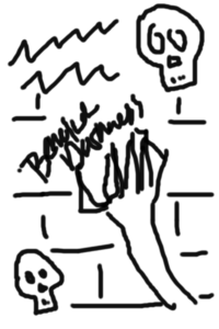
I’d post the original first cover here, except I’d have to cite the artist. See my rendition:
It’s basically two mirrored skulls and a hand with blueberry juice on the tips of the fingers. The font is one of those round, sloppy, “handwriting” types. I’m 99% sure that cover came from their stock of pre-made covers.
Um…other than there are hands in my book, since my character are human, that’s all that’s relating to my book’s concept. I clearly specified that in the first book, the main villains are terrorists. The cannibals/zombies are there, yes, but they’re just getting traction. Not until the next book do they have a population explosion.
At this point I had the realization that I have to tell them exactly what I want, despite them saying they can come up with something from just a book description. It appears I misunderstood what that “something” was, naively assuming it would accurately convey my concept.
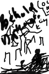
Since they were hassling me for input, I had to think fast. So I threw Rise of the Governor at them. It’s like a lot of zombie books, where there’s a city skyline with some silhouettes of figures looking at it. They handed back a crooked – artistic! – shot of San Fransisco, with a silhouette looking at it. There’s a giant skull randomly in the top right corner like an asteroid about to hit the city.
So I tell them to hold on until the next day. I spent that day looking at covers on Google, Amazon, and Goodreads. I combined a few covers and ideas. Then I busted out the Gimp and spent 2 hours making a cover that was pretty passable.
They come back with, “I’ve already done two concepts and don’t have time to do another.” When did you say I was limited to two? Also, how does the first one count? it was one of your pre-mades that had nothing to do with my book. I’d bet donuts you didn’t even read what I sent about the novel.
I offer more money. Suddenly the story becomes that it’s not their style and is beyond their skills. Say what? Uh, I whipped this up with my laptop, which has a bare-bones version of Gimp, in two hours.
Thus, I spent my weekend making my OWN cover. It looks great, IMO. But you’ll have to wait till the cover reveal to see it.
Conclusion:
In conclusion, if you have the skills, and you know the design will work (I based mine on a number of books that are good sellers), go for it. Otherwise, check out Damon, or the cover artists this blog lists. You can go to Deviant Art, but that’s a rabbit hole. Look at their portfolios and see if the books match your genre. Check out their pricing, too, and any small print.
Have in mind what you want; don’t rely totally on the artist.
Premo service that I use:
https://www.shutterstock.com/
Free stock image sites:
https://www.goodfreephotos.com/
https://burst.shopify.com/
https://stocksnap.io/
What do you think? Are cover artists always needed? Have you ever designed a cover? What’s the worst cover you’ve seen?
Comment!
And don’t forget to join my newsletter so you can get updates and the first twelve chapters of Behold Darkness for FREE!

